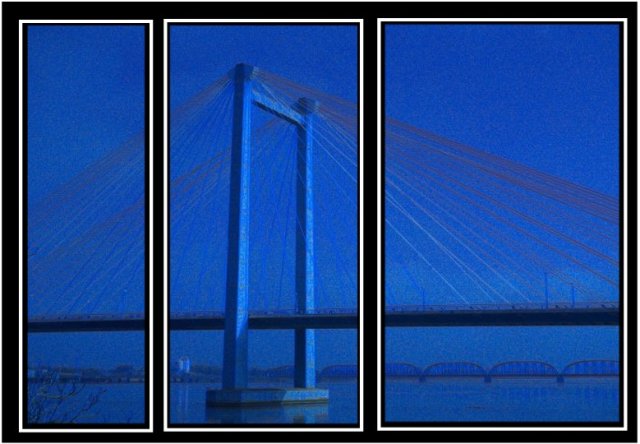
i quite like the misty look of the diffused blue. i think that the harsh black and white makes it look like it should be sharper, but with simpler borders, this would flow very well!
I think the glaring black and white borders detract from the shot quite a bit. A thinner and perhaps darker (gray rather than white) border would probably help to emphasize the shot.
Hmmm, I can forgive the noise, but I think this would have been much better had the stays been in sharp relief. They would have countered the vertical frames nicely. I like the blue. 6
How does the division of your picture into three frames enhance the photo? How does this "tell...a story or illustrates a concept or object" better than the original image?
I like the concept, but the image is a little to blurry and noisey for me. Also, the pictures themselves are not aligned - the image on the left is lower then the middle and far right side.
I know this meets the challenge, but I am not a big fan on just cutting up one nice shot into 3 with distracting borders. Seems too easy, no real creativity required.







 Add photograph to your favorites
 Add photographer to your favorites

 Photographer found comment helpful.


