Very nice photo. I don't think this particular photo lends itself to triptychization though. Doesn't make me want to stop looking at it though - technicals and aesthetics of the photo are perfect.
Returning for comments and a bump to (10) Perhaps my favorite of the challenge.
The more I look at this, the more I like it, and added it as a favorite.
Has a magical feel to and is very nicely laid out & divided.
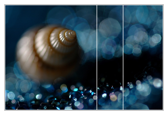
I love the very shallow DOF and the image by itself. I'm not a big fan of the "separation choice". The image by itself would definitely be one of my favs, but as a triptych I don't think it works quite as well. I also think the extra wide white border is a bit overkill.
interesting. I like the bokeh. the focus on the shell is a bit too shallow for my taste, but you manage to bring it off. the colours and their combination is good. best of luck.
I LOVE this photo. The colors, the depth of focus, everything. I'm not sure about it as a triptych, though. It doesn't ruin the photo but it doesn't really do anything to improve it, either. As a single shot, though, it's perfect.
Wow, you could shave with that dof, very impressive! Call me a newbie, but I don't think I've ever seen such pretty bokeh, and on BOTH sides of the focus plane, no less, sheesh!
I have come back to this photo several times during my voting. I'm not real fond of the focus here and I can't decided whether the division of this into three panels is a plus or a minus. I love the color and think that with a little more focus on the shell this would be an incredible shot (and possibly a good entry into the Free Study). 6
How does the division of your picture into three frames enhance the photo? How does this "tell...a story or illustrates a concept or object" better than the original image?
This looks like a Dax entry. the blues and overall tonality of this image is very nice and pleasing to the eye. The thumbnail works well and immediately grabbed my attention. I was a bit disappointed when the shell wasn't in full focus. if it were, this would have ranked pretty high. The use of "odd" frame sizes works well and I'm glad that you did it this way so as not to divide the shell in pieces. 7
I just Love this image. It is so very chimerical.
As it goes, i probably would have prefered it as a whole image rather than a triptych, but your use of the 3 differing panels was definately the best approach i can see for dividing the image.
I like this image as a "whole" more than a triptych...the dividing lines seem to be more a nuisance than anything else, I wish they were gone, but then this wouldn't be a triptych...anyway...love the colors and awesome bokeh!
Lovely shot! Colors, lighting and focus are absolutly beautiful. I'm not sure how well it fits the 'triptych' theme, I think It would be perfect without the splits, but it might have worked a little better for me if the right side had been divided in half by a horizontal line rather than it is now by the vertical line.
so nothing's perfectly in focus, it seems to go against all my photo knowledge, yet i love it! i don't know why but it is VERY interesting! great shot!!
This is beautiful. I love the blue and orange. I also love that the shell has that one focal point and the rest is blurred. The placement of the breaks in the triptych is a little awkward, but I'm not sure what would have been better.






 Add photograph to your favorites
 Add photographer to your favorites

 Photographer found comment helpful.


