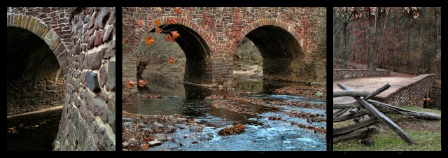
The image on the left is a bit too abstract to "go with" the other 2 images. The shadows are a bit too dark as well.
The image in the middle has a bit of leaves obscuring the left arch. (What a pain to clone over bricks!)
I think the picture on the right could be improved by showing more of the fence to include all of the road. Your DOF in all 3 is impressive. Comments meant to be constructive, hope they help.
I'd like to see this a little sharper and possibly even with a touch more color saturation. The left two images are my favorites; nice theme with the leaves moving down the river and under the bridge. The third image doesn't really seem to fit (I had this happen with my entry, too).






 Add photograph to your favorites
 Add photographer to your favorites


 Photographer found comment helpful.


