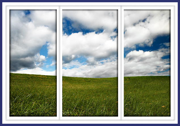
At first glance I'm impressed. I like the window look with the boarders and find them to be very well done which is rare because I don't usually like boarders.
The 3 panels in this photo have a nice even flow to them which draws the eyes thru the photo and makes the viewer believe that they are actually looking thru a window. I don't think it quite fit the challenge very well as it appears to be one photo split into 3 which in my opinion kind of defeats the purpose of triptych. The colors and clarity are outstanding and the photo has a appeal to it that I don't usually see in challenges. Perhaps for example if the was a kite in the left panel and a kid in the right panel with string running thru the middle panel would have blended these photo's more together. Nicely done and I look forward to seeing more of your work.
How does the division of your picture into three frames enhance the photo? How does this "tell...a story or illustrates a concept or object" better than the original image?
7 - Nice, simple, good 3d effect, good colors and good 'window illusion'. Criticism; not much, seems to be a minor 'flaw' top right on the semi-transparent blue inner frame. Perhaps the '3d effect' (inner shadow) applied more uniformly may have given even more impact, not sure, but does seem you applied it to the first panel 'entirely' but not 2 & 3. Good detail in the grass and sky, even at this size. Nice balance and good 'flow'.
Wow, the picture itself is. . .well perfect IMO. What luck to have happened along a sky like that! I really like the borders though I think I found a mistake on the left pane. Did you mean to have a shadow on the far left vertical? The other two panes do not have it. I also notice In the far upper right and lower left corners of the border a slight break in the grey area. Other than that I wouldn't change a thing. Comments meant to be constructive, hope they help.





 Add photograph to your favorites
 Add photographer to your favorites


 Photographer found comment helpful.


