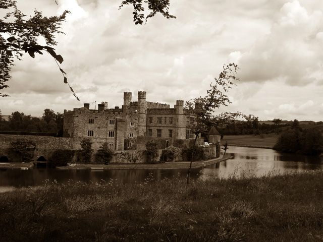
Colour may have brought this to life a bit, and less sky may have increased the buildings impact. Seems slightly off horizontal as well. This toning has brought out the cloud textures well.
Good subject for the challenge. Composition is a little too centered - maybe put the country home more to the left and show more of the river. A tad dark and not squared up.
Composition: Nice use of foreground for depth. The tree in the mid-ground looks a bit out of place though. Needs rotating CCW
Technical: Good quality and use of duotone.
Meets challenge: Yes
Overall impression: Nice choice of subject, not sure on the composition.
Great picture although perhaps a little bit too dark. Also a slight anti-clockwise rotate to make the turrent point straight up would have helped. Great subject and composition though.
I do think your choice of black and white works well here, though the pic overall seems dark. The photo seems to be leaning a bit. I do love your composition with the branches in the foreground and your choice of subject is very cool.





 Add photograph to your favorites
 Add photographer to your favorites


 Photographer found comment helpful.


