Shot in kitchen using light through back door.
I tried various lighting and finally settled on the late afternoon sunlight.
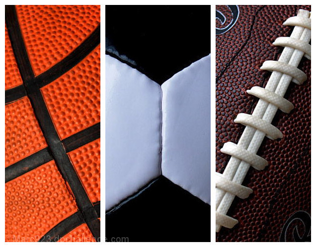
Basketball:
f/9
1/200 sec.
ISO-400
Date taken: 11/09/2005
PSPX edits:
resize, clarify (5), brightness/contrast adjust (0/15), curves adjustment, crop to size, add border to whole picture.
Soccer Ball:
f/5.6
1/15 sec. (w/tripod)
ISO-200
Date taken: 11/11/2005
PSPX edits:
resize, brightness/contrast adjust (0/25), cool color balance, cloned imperfections on parts of ball, noise removal crop to size add border to top and bottom of picture.
Football:
f/5.6
1/2 sec. (w/tripod)
ISO-400
Date taken: 11/11/2005
PSPX edits:
resize, clarify (5), curves adjustment, crop and add border to whole image. I shot this one 4 times to get this look.
Then put them together and voila, we have a sports ball triptych.
Statistics
Place: 17 out of 234 Avg (all users): 6.4276 Avg (commenters): 7.7600 Avg (participants): 6.1894 Avg (non-participants): 6.6266 Views since voting: 2716 Views during voting: 487 Votes: 290 Comments: 28 Favorites: 7 (view)
6 - Very good concept. Criticism; the 'artificial surfaces' are so well defined that they are the first thing I noticed in the texture detail, especially in #3. Texture is good, but doesn't have as much character/'feel' as different quality (leather) balls would have had. Color choice and arrangement is good. #2 is not perfectly centered, which would have been better in my opinion, but perhaps you were going for 'off center'. Like the diagonals on 1 & 3. The white frame works, but I wonder if perhaps even thin inner frames as well may have given more depth here.
Great detail, nice even lighting. I like the consistency it has between the 3 images, tying them together, and the way you made the angles symmetrical for the main lines in the balls.
For some reason, not sure why, the basket ball does not seem as nice of a shot as the other two, maybe because it has more light shining off of it. But a very nice shot.
This photo is very appealing. It gets a 9 from me and is my 3rd place finisher :) The only thing that took away from this image for me, is the basketball's lighting is much more flat than the soccer ball or the football. The lighting may be the same on the basketball and the soccer ball, but the black hexagons on the soccer ball give it more shape. The top of third of the basketball seems like it might be a bit soft. BUT........I am nitpicking here. I really do love the image.
I see 'V' for victory in this composition. Though it goes against the grain of a traditional triptych I feel that it works quite well.
What might improve it though is to make the black on the basketball the same as the black on the soccer ball and the white laces on the football the same as the white on the soccer ball. This, to me, would increase the transition from one image to the next.
Maybe not the most interesting shot in the challenge but technically it's really well done. The exposure and focus are perfect, and the lighting is good, especially on the football.






 Add photograph to your favorites
 Add photographer to your favorites

 Photographer found comment helpful.


