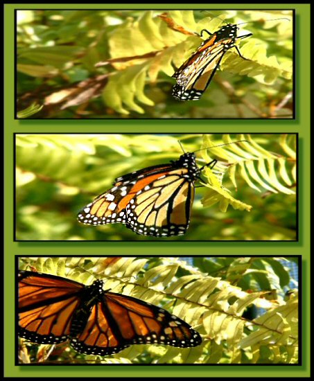
This was easily done using PSP and the magnifying tools (frames), without using the magnifier. The person who commented that the photos look blurred, it is because the DOF was on the butterfly, and the branch he is on along with him are in focus. The original shots, the surrounding branches were purposely not in focus. Someone also said that they looked pinched. It is the opposite; they were stretched a bit, but not pinched. The trip tells a bit of a small story. The top one is where he landed, the second one down shows him looking at me and posing, and the third is where he opened his wings for me to take the shot of his full color. Thank you for taking the time to look and vote.
I like this triptych. I just would prefer the butterfly in the lowest frame to be in more light, and even better would be if the background was less lit.
It looks like you were going with a 3-D effect on the frame. There's a great 3-ness in the composition, going from big, lower-left placement, center, and finaly, folded wings with a right subject placement. The frame doesn't work well for me online at all, although I can see that it might be nice in a bigger version and on a wall. I think it is the brightness of the green against the gray of the voting background that bothers me. The light, colors, and composition of the actual images, though, get high ratings from me.
I like this but I think just a simple thick black border with a thin white accent would have made this a better triptych. The green border is too over powering for my taste.





 Add photograph to your favorites
 Add photographer to your favorites


