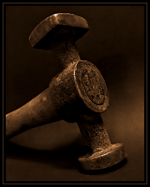
nice rendering of this tool's volume and textures. Since the challenge authorized it, I would have done something to get wrid of this "rap around" shadow at the bottom.
Indeed, an interesting shot. The lighting is what really makes this photo work for me. I love the way the subject "fades" in and out of the dark areas, kind of making your mind fill in the blank areas. The composition is very nice, and the texture of your subject adds a wonderful dimension to the shot.
this is very nice. the sepia tones are working well here, and the diagonal composition of the hammer is nice. i feel like maybe a little more negative space would help balance this big hulking hammer, which really feels like it's overfilling the frame even though it technically isn't (if that makes any sense). perhaps just a tad too symmetical, as well. overall though, really well shot. 7.
I like it a lot! I'm glad to see that there's at least one other shot that, while "dark," isn't necessarily "black." My interpretation was that the shot should be low-key, and this meets it just fine. I'm sure you'll find a variety of opinions as the challenge progresses though...!






 Add photograph to your favorites
 Add photographer to your favorites


 Photographer found comment helpful.


