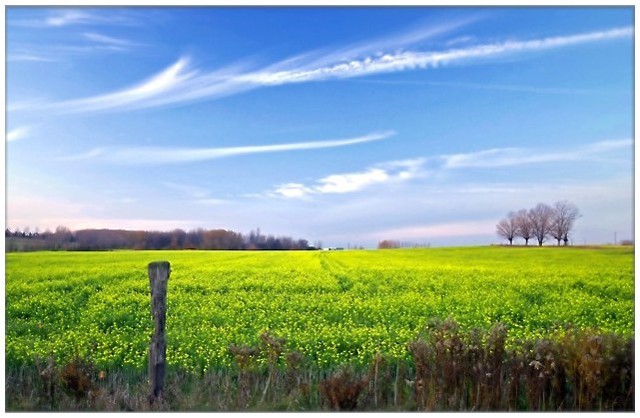
7 - Very nice. Criticism; looks a little 'soft' (but perhaps you were going for that), would like to have seen some more definition somewhere, perhaps preferably on the field, not sure. Nice colors, but do wonder if they could have been a touch more vivid, especially the red/brown tones in the fore shrubs/hedge and far 'woods'.
I like the picture, think the idea is great !
However, the pole on the left side tends to distract the eye from the remaining of the picture.
I would also have either "moved" the horizon closer to the bottom, of to the top (so increase the impact of the yellow flowers. You could do that by just getting past the pole on the picture and take the photo again.






 Add photograph to your favorites
 Add photographer to your favorites


