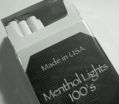
Although I agree with the sentiment, this challenge is about the image, not a pun title. That said, the orientation of the pack serves to draw the viewer into the picture. The cropping, however, is problematic: the shadow on the left should not have been cut off, and it might have been better if the package had not been truncated at the top. Overall, the image is muddy...no real blacks or whites...trypunching it up by adjusting with 'levels' in Photoshop (or, better, with 'curves').





 Add photograph to your favorites
 Add photographer to your favorites


 Photographer found comment helpful.


