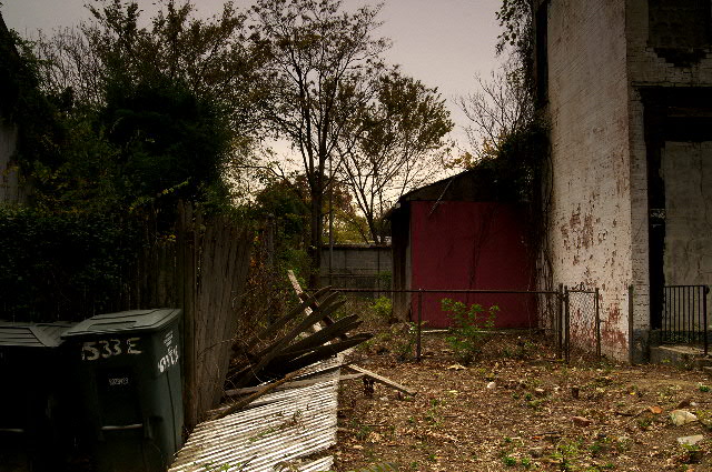
I agree with you..I don't see this making a great b&w really..and am a fan of the subtle tones, especially the red. i find that people on this site tend to want bumped up saturation quite often, where more subtle tones work well. I think if you bumped up contrast etc. you would end up fragmenting the decayed look..the only problem with me agreeing, is I tend to go against the grain frequently, so don't listen to me if you want to score higher.
Nice work.
I really thank you very much for commenting, but I, with respect, disagree. The lighting was intentional -- including the murkiness. I felt the bushes were an unimportant point of interest and only needed a suggestion of detail. As for the color, I think it defines the individual shapes of the building, the shed, the fence, and the bins.
Dark things with detail, I find, are very hard to photograph properly. The whole left third of your picture qualifies. The bushes look like a murky mess.
The composition isn't bad. I like the trash cans, which are the main subject in this challenge, are far to one side which is interesting.
A number of other pictures I commented on had the same issue with color. The colors here are unimportant and unimpressive, so try B&W. The picture then becomes more about texture and pattern and the detail of the detrius on the ground becomes more interesting.
I really like this, it doesn't have much compositionally but there is something about it, the white wall on the right, next to the red, the green dumpster on the left and the fence falling down in the center - seem to really balance all out really well. Perhaps it's the editing as I really like the colors and lighting - it fits the challenge and really is a quality image - nice work :)







 Add photograph to your favorites
 Add photographer to your favorites

 Photographer found comment helpful.


