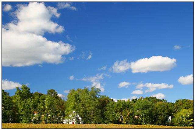
I feel that if you had added a bit more of the land and a little less sky - used the rule of thirds a bit more - then this would have been superb. It's good but the land part is dominated by its sky.
excellent use of color. this image is weakened by the fact that its strongest lines all run horizontally. there is nothing to provide a sense of depth, thus the picture looks flat. a focal point is also lacking.





 Add photograph to your favorites
 Add photographer to your favorites


