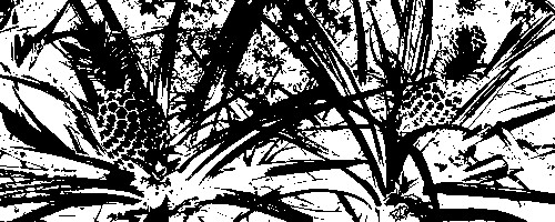
Because the pineapple is the symbol for hospitality, and because you often see replication of them around plantations/farm houses, etc., here in the Southern US, I can see your link to the challenge, albeit a strenuous one. :-)
The composition of your photo looks balanced and well framed. The two forms of the pineapple help to balance each side and give the eyes somewhere to rest, while still providing "movement" in the image. Also, I like the contrasting angles of what I assume is "greenery" in the image.
What I cannot comment on are the technical aspects of the image, such as focus, lighting, etc. Though this is a valid effect to use, it does tend to make it more of a digital image than a photograph, which does not typically do well on here. I, for one, find it interesting, but can't help but wonder if you were trying to disguise a really, really, really bad picture. I looked at your profile, and I just assume you like this style. That's fine.
I can see your link to country life in this photo, but it is not strong enough to communicate that theme to me effectively. Interesting effect, but that is also what detracts from the photo for me personally...
This is a bit of a Photoshop cop-out for me. Although it's an interesting pattern when viewed as abstract, it has no emotive or stylistic focal point or purpose. As for the challenge 'Country Life' it's a bit shoe-horned, so I can't rate this very highly. Feel free to comment on my comment though!!
I like it a lot. I'm sure it won't score well, but I'm not the only one too like it I'm sure. Don't let them get to you. This IS art and I think it is well done and well executed.






 Add photograph to your favorites
 Add photographer to your favorites


