-1 for spelling! Sorry, the teacher in me came out! :-)
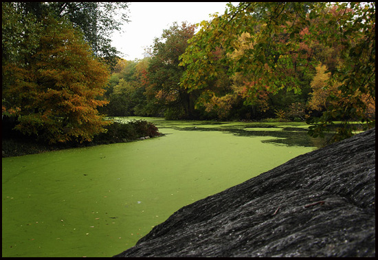
Cool photo. Everything looks pretty good until you get to your sky and it is too bright with too much digital noise in your midtones (see purple and reddish cast?) I also think the rock formation sloping off the right in the foreground is a bit distracting from the colors of the green slimy stuff and the beautiful Autumn colors on the trees. If you could have just gotten the river/pond/swamp? and trees and worked out the white balance and digital noise in your sky, this would have (IMHO) been a great shot.
5 - Mostly for the potential. Criticism; firstly, at least the width to be 640, if not the height as well, depending what you were going for/what was 'there'. I like the colors in this, especially the green duckweed/algae/whatever and the contrasting black/slate rock and would like to have seen, perhaps a sharper angle (ground/rock) and more of the rock and river(?) (again dependent) incorporated, as well as the other side of the bank if possible, especially for this Challenge. edit:typo - sorry you did not find my comment helpful





 Add photograph to your favorites
 Add photographer to your favorites


 Photographer found comment helpful.


