Author Thread
Post actions
I'm having serious issues with this damned thing here.Message edited by author 2005-11-18 04:07:44.
Post actions
This has a lot more subtlety than many gave it credit for.
Post actions
[double post] Message edited by author 2005-11-18 04:06:07.
Post actions
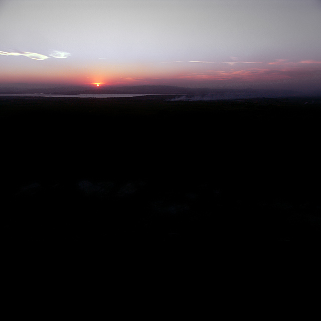
No steel empyrean could be better placed than above such expanse of night. This is a poignantly balanced image, both compositionally and via a remarkably delicate treatment of colour, hue and tone.
Message edited by author 2005-11-18 01:01:47.
Post actions
29 helpful comments. Oh dear you are positive.
Post actions
People comment say negative space but I think is well done. It is smooth and clean picture as colours shift slowly from bright to darkness. Hills at near sunset is also beautiful but if only bigger, easy see. I like your photographs and add one my favourites!
Comments Made During the Challenge
Post actions
Great shot and colors. I love the steam, it really adds interest to the shot.
Post actions
Too much black space on the bottom for my taste. A higher crop would have been better.
Post actions
Maybe a little too much negative space IMHO. 7
Post actions
I found the large black area at the hbottom of this image unappealing. Using only the upper part of the image, with a black area in perhaps the bottom 1/3 of the frame might have worked better.
Post actions
too little colour...too much black
Post actions
In my opinion, too much black foreground. But that's just me. Otherwise, I really like it.
Post actions
This photo is too dark - there is not enough for my eye to explore.
Post actions
nice sunset, but the foreground looks way too dark.
Post actions
2/3 of the photo is a big black void. Still a nice picture, but would have been better with the horizon at the bottom 1/3
Post actions
more than half the picture is black
Post actions
colors in the sky are very pretty, but the black lower half overpowers the image. Possibly more sky may have improved this image. IMO
Post actions
not sure the black tells us very much, some of it could be cropped without losing the effect
Post actions
way to much space gone to waste there ... cropped through the middle of the picture would have made it better. 5
Post actions
nice title. too much negative space for my tastes..
Post actions
Telezoom lens could help here.
Post actions
I probably would have crop the botton of this some and added nore sky. Otherwise it is a nice photo.
Post actions
nice colors of the sun on the horizon. The foreground is too dark I think. I croped out all but about an inch of the black and found the focus to go more towards the sun. Of course this is my own personal taste, so please don't take it the wrong way. Very nice though.
Post actions
Post actions
I really like this composition. I feel that the sky is able to hold up the big black space in the lower part.
Post actions
Certainly unique. I think more dramatic colors would have helped, strong oranges and blues. to balance off all the black space. Still its good 7
Post actions
Nice picture, I think a tighter crop would've been better
Post actions
I think a crop of the bottom 2/3rds of this would make it awe inspiring
Post actions
nice colour of the sky. Maybe too dark in the area below.
Post actions
too much dark the bottom side !
Post actions
Good application of the rule-of-thirds. But what about the empty two-thirds?
Post actions
too much black negative space for my taste
Post actions
I'm sorry, I really don't like that much negative space at the bottom of a photo unless I'm missing some detail at the bottom, which I can't see on my monitor?
Post actions






 Add photograph to your favorites
 Add photographer to your favorites

 Photographer found comment helpful.


