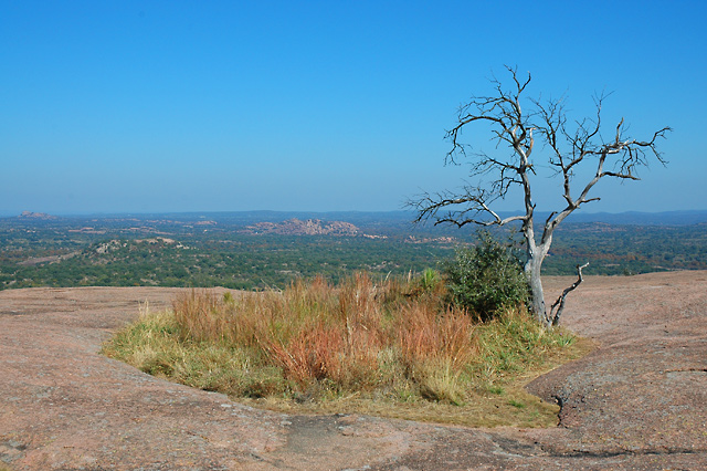
I don't know if this is personal taste or not, but I'm always turned off by this shade of blue. It looks like an old, faded picture to me. Time of day (and thus location of the sun) and polarizer use is big here.
The colors suffer from lack of punch. I upped the saturation by +20 and that helps quite a bit. You can also try to go B&W in a picture with faded color. The red channel wasn't a bad pick. It made for a nice dark sky.
Composition isn't bad. On one hand it's centered, but on the other hand the tree is asymmetric. I can't quite decide which is dominant. |





 Add photograph to your favorites
 Add photographer to your favorites

 Photographer found comment helpful.

