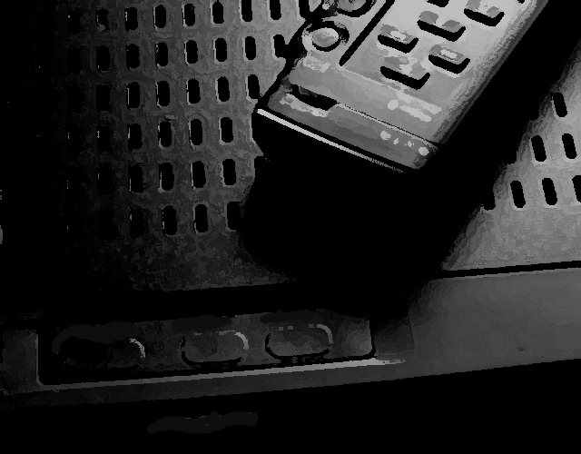
You've made a graphic image out of this photo, and I don't mind that so much, though I'msure that some do mind. I do enjoy the lighting and especially the arrangement of the objects in the frame, added to excellent cropping. The low key lighting makes these every day objects seem mysterious in a technology sense, as these are the images that fill the frame.
Speaking only for my personal aesthetic preferences, the blotchy/gloppy over-modified 'focus' here is bizarre and very distracting. If it were focussed more mundanely, this could well have been a 9 for me. As it is, 5.
your digital effects are really detracting from this image. your choice of subjact matter was probably a little on the boring side and you felt the need to give more interest to the image, but it's not working. lighting seems okay, but i can't really tell much. it just doesn't have the feel of a "photograph". 3.
I know that this was an open editing challenge, but what you did to this photo makes it, in my mind, appear to be overprocessed, and look like a drawing/water color or something. I'm not sure I really care for what you did here. I think that emphasis on a photography website should still be put on the original picture more than the editing, even in an free for all editing challenge. Just my opinion though.





 Add photograph to your favorites
 Add photographer to your favorites


 Photographer found comment helpful.


