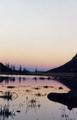
Interesting and pleasant 'hour-glass' composition, but, IMO, the field of view seems a bit too narrow to be called a landscape. The upper right area is blown out. Try adjusting your image using the 'levels' control (or, better, curves) in Photoshop (or their equivalents in your software).
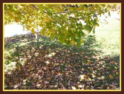
This shot has too much dynamic range for your camera. You have areas on both the right and the left that all the detail has been washed away by the bright sunlight. The shaded areas don't get enough light for the beauty of the fallen leaves to grab my attention. This type of shot is better on a cloudy day where the sunlight is filtered and there are no deep shadows to fight.
It's hard to tell the detail of this photo :-( Go ahead and make it as big as DPC will allow!! :-) From here it looks like the colors are pretty good, but I think the angle would be shown off better if the submission was larger.
This border is really distracting and it's hard to make out the detail in the image. Using the full 640 pixel allotment and leaving out the thick border will allow the viewer to be able to see the detail in the leaves much better and make the photo much more interesting.






 Add photograph to your favorites
 Add photographer to your favorites


 Photographer found comment helpful.


