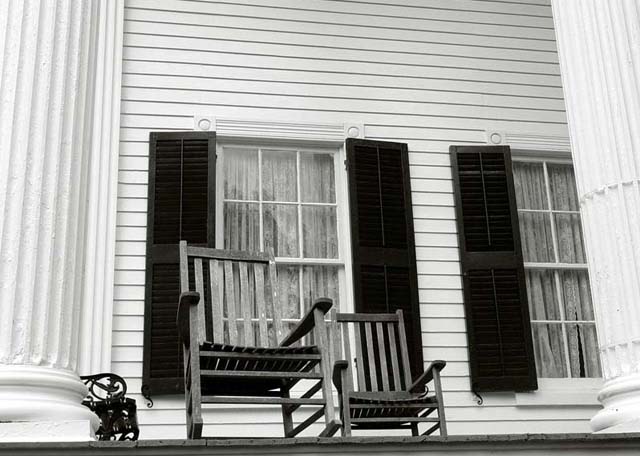
nice - but the chairs seem overshadowed by the buiding. I might have cropped some of the top of the building so the chairs were more of the focal point.
nice idea.. nice colors.. a recommendation: may be the wood floor is more interesting than horizontal wall lines.. and left column is so distracting.. you should try to re-take this photo. =)
Shot a bit too low. We don't see the rungs of the chairs and this is not good. The pillars and widows are more visible. Also your focus and tones are very nice.
Really like the angle of this shot. I know the chairs are your subject, but all those lines fight with the window for attention; might have been simpler without the chairs. Effective use of border - especially considering DPC's gray background.






 Add photograph to your favorites
 Add photographer to your favorites


