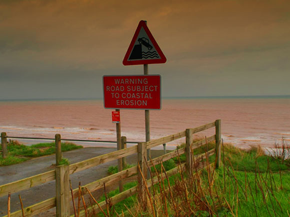
I am not sure if I like the "graduated" effect on this image and cant make up my mind if it is an actual filter or the way the light actually was (Graduated Tobacco filter maybe?) as it leaves the sign looking a bit dark. Also it has the Neat Image sort of effect which has left the writing on the sign looking strange.
I love the choice of color and the soft yet bold feel of this comp. The challenge is met very well and I think you are a top 10 with this image... well done... :)
I like this place but your shot seems to have been post processed a little too much. The water looks like mud - is it? I would like to see the original.
That's some strange post processing there. It seems incongruent somehow and I'm not too keen on the overall effect, as a matter of personal taste. Very interesting feel to it otherwise. Could do very well. Good Luck!





 Add photograph to your favorites
 Add photographer to your favorites


