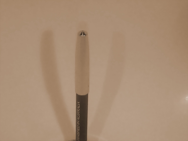
I think this picture could be made better by doing couple of things. My first impression is either it needs to be center more exactly or just to the left a little. Also, if the background was a different color, there may have been more contrast and the shadows a little more visible.
An interesting concept, but to me this looks like more of a starting point. You might find an object that presents something a bit more interesting for the viewer and then work on the lighting a bit more.
only 70Kb submitted here - your allowed 150Kb - post in the Q & A forum to find out how. your pic needs an upright(portrait) format rather than the landscape format you have chosen.
Yes, there's a shadow here (two actually, you are overachieving). I like the idea of the symmetry, but the pen needs to be placed exactly in the middle (more symmetry) or further to the left (rule of thirds). You are also not using the whole file size that you could've, I'm wondering whether that could've gotten rid of some of the compression artifacts, or whether it was just the light conditions and the camera...





 Add photograph to your favorites
 Add photographer to your favorites


