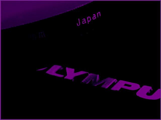
i'm not a fan of the crazy purple effect, and it looks like you've pumped the levels or contrast to make this more arty. overall, i think it's a mostly boring subject that you've tried, mostly unsuccessfully, to spruce up. 3.
Nice, dark colors while retaining some light. The light in the corner really draws my eye to it and is distracting to the main components "japan" and "lympu".







 Add photograph to your favorites
 Add photographer to your favorites


 Photographer found comment helpful.

