Went through so many changes with adjustment layers and dodging and burning, and rubber stamping that I've totally lost track of what I've done now! My first serious attempt with dodging and burning... very tricky! I prefered to use adjustment layers with gradients.
Statistics
Place: 1 out of 92 Avg (all users): 7.2000 Avg (commenters): 9.0000 Avg (participants): 6.9865 Avg (non-participants): 7.5098 Views since voting: 7297 Votes: 125 Comments: 36 Favorites: 29 (view)
And BTW that's a pretty tiny camera. I looked at one at the Future Shop last week. It was so tiny I was afraid to pick it up. Certainly packs a punch though. :)
This is one of my favorites in the challenge. I love how the arches fill the composition. I like the long passage way to the right with the sunlight making steps on the floor, The details in the stones of the arches are great. I'd crop the bottom to get rid of the half included spot of sun - or include it entirely. Why is the base of the pillar blue? I love the ancient feel the pic gives - good subject for black on black. 9
Absolutely one of my favorites! Very mysterious and "other-worldly", this shot just draws me in. Almost creepy, and yet makes you want to know more. Can't imagine a better shot for the challenge.
Great volume and shapes, i would have tried go give a little more visibility to these practically invisible row of columns. The light source slighly moved to the left to improve the overall balance. Still, a good image
Although I find this image quite dark (leaving the eye preciously little textural detail to feast on), it remains one of the most striking ones in the challenge.
The chosen (or found) subject alone is without doubt worth more than a fleeting look. I like the simple adaption of the architectoral structure (i.e. the form of the arch) into the composition and the skillfull balancing of relative weight in the foregound (the expanse of the dark on the left vs. the but 'riveting' light inside the smaller, perspective gate as well as in the stepped up shutters toward the viewer). The light and the dark, again, are linked perfectly in respective one and two thirds, but this time leading the eye back instead forwards. Definitely a piece fit for exquisite pleasure 'and' study.
this is really nice. i love the shapes and tones here, especially the path of white coming from the window. this must be a really awesome place to be in. good job controlling the light and tones. my only (very) minor gripe is the little cyan blue line in the window. i would have edited that out. it draws my eye while i'm looking at that portion of the image. 9.





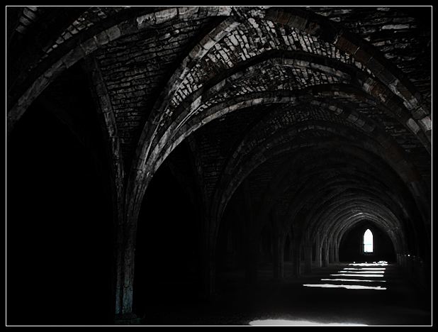
 Fountains Abbey
 Add photograph to your favorites
 Add photographer to your favorites

 Photographer found comment helpful.


