It looks like this photo could have been very interesting, but it lacks form and shape, so its very hard to make out anything. The pincushion distortion and the appearance of it not being quite straight also detract as does the top edge of the shade, which would have looked better if it had of been trimmed out. You just would have needed to drop down a bit to get your hands in then
A little hard to figure out which way you're facing and what position your body is in. Maybe that was part of the concept--sorry if so. Also, it might have been nicer if the bulb had been hidden by the screen... I do like the silhouette idea though.
lovely pose. i only wish the light at the top wasn't there. the diffuse light is very powerful...methinks you spend more than a little time doing yoga.
Nice concept and I like the format. However, I wish the bare light bulb at the top of the picture was hidden or cropped out completely and I wish the entire door was evenly lit throughtout. In addition, I find the sides not to add anything to the photo, so would have liked them cropped out too, unless light shed on them would have revealed something interesting to look at. Colors are too drab and would have liked some other kind of effect, even a small spot light on the face from the side or behind to add a more personal touch.
An interesting shot - it's just a shame it wasn't lower down to avoid the harsh lightbulb. You could have crouched down so that your hands came lower than the screen, then the image could be cropped at the screen edge. Try obscuring the bulb - it looks so much easier on the eye and draws you in to the shape of your body without so many clues as to what you're looking at..
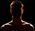
I think a portrait should reveal some character, or emotion of the model, by showing expression in eyes or other facial features. Did your picture accomplish that? Not really.
I think this image would have been better if you had moved the camera further back, moved it down, and zoomed in a little. THe barrel distortion (see the frame of the door) and the kight at the top are a little disturbing. For the setting and the pose alone, however, you are getting a 8 from me. Good work!






 Add photograph to your favorites
 Add photographer to your favorites


 Photographer found comment helpful.


