This was your entry in the Transparency II challenge and it fits the brief very well.
Technical:
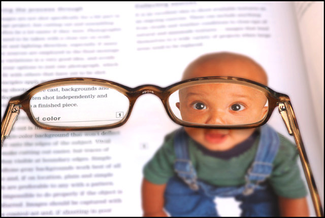
Good use of maximum size allowed. Good DOF and focusing. None of the processing or sharpening seems overdone, although the arm of the glasses on the left of the photo seems a bit over bright. The centre of focus is the glasses and so is sharper than the child's eyes.
Composition:
A well composed image. The glasses divide the image 50/50 and I don't quite see the connection of the text with the child, unless it is the words highlighted. It is a clever move to include the child's eyes in the one frame of the glasses and it looks like the child is actually looking at you.
Overall:
Not the most original idea but it works. There are some nice touches, the focus is great as is DOF and it is not easy to get a clear shot of a page and through glasses. Nothing has been overdone in the processing stages and your score reflects the opinion of voters. I will watch your future entries. I hope this is helpful and constructive.
7 - Good idea and has humor. Criticism; not much, maybe a different crop, centering the frames more, and perhaps a different placement of the glasses so more befitting words appear in the left lens, depending of course what is there.






 Add photograph to your favorites
 Add photographer to your favorites

 Photographer found comment helpful.


