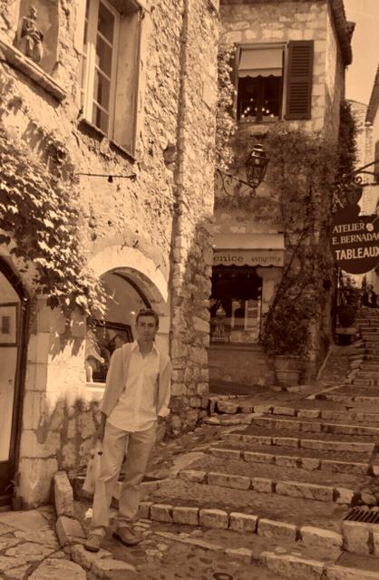
Pleasant scene, but I don't think your obviously modern clothing fits with the setting or the sepia tone. Perhaps you should have dressed in period costume? :-)
Wow, it's really tilted to the right. Should have rotated it a little. And the sepia tone is too strong in my opinion. Nice looking surroundings however.
I like the feel of this photo, but I would a) kick up the contrast a little to go for an even more dreamy effect, and b) make yourself more of the subject of the photo than the architecture. I like the photo overall, but I'm not sure "self-portrait" is what jumps to mind because you almost blend into the background and don't really stand out as the subject.
I love this shot, but probably for the wrong reason. The buildings and setting is absolutely beautiful and very interesting to look at but completely overwhelms you to the point where I would think this to be a shot taken by tourist aiming more to cature the setting. But you should be the main event in a portrait. Tones are very pleasing to look at, but you get lost and blend in to the point of becoming part of the background. Also, you needed to rotate this picture as it appears to be leaning right. BTW...is "Back to the Old Days" the name of a magazine?
whoa, easy on the sepia. i'm a little overwhelmed by that. that stairway is nice, should have used a bit more of it. also, you should have done something to stand out from the background. nat light, a flash, something
I think a portrait should reveal some character, or emotion of the model, by showing expression in eyes or other facial features. Did your picture accomplish that? Not really, although there is some body language.
Lighting: Fair
Exposure: Good
Focus:ok
Creativity:ok
Composition: tighter crop would be better
Background:Good
Overall I think you get lost in the picture. If you cropped closer, perhaps around the arch, it would have made a good natural framing.







 Add photograph to your favorites
 Add photographer to your favorites


 Photographer found comment helpful.


