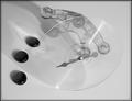
composition could use some work. think about where the lines are going in this picture... they're converging on a spot in the bottom of the frame. generally speaking, you should arrange your elements so that the focal point is not so close to the edge.
I think your slice is too thick. I learned this on the last texture challenge. If it's too thick you have too much fighting for focus and it makes it all seem blurry. I think the version of this which did Top 10 in the last challenge had razor thin fruit.
Unique brilliant color and textures--I like it. Not to be too technical, but I think this is more translucent that transparent, nonetheless--It's a great image.






 Add photograph to your favorites
 Add photographer to your favorites


 Photographer found comment helpful.


