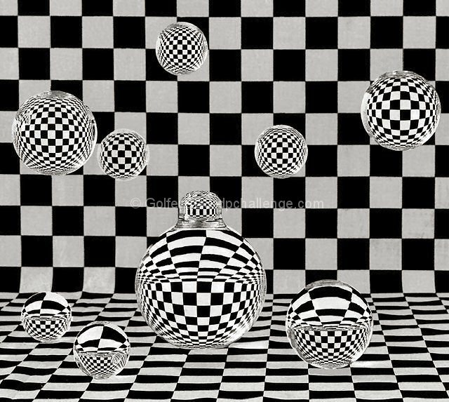
This setup, execution, and processing was more complicated than it needed to be because of several factors including lack of time to find suitable materials, lighting inefficiencies and the need to use PS to correct these inadequacies in the executed picture. The spheres are glass lightbulbs which I cut off the bases. Several cracked in the process but I couldn't find anything better to suit the subject. I liked that I could find lightbulbs of different sizes. The backround is checkered fabric. The spheres were hung from the ceiling with thin clear nylon fishing tackle and the spheres were all filled with water. The spheres on the table were placed on small supports which were cloned out in post processing as were the lines hanging from the ceiling. The picture was taken under poor indoor lighting conditions as I do not have adequate photographic lighting equiptment and the white balance was adjusted accordingly. PS repairs were made to the tops of the spheres where I was not able to achieve a smooth cut due to the fragile nature of the glass. Also, some of the light reflections in the glass were cloned out to give greater contrast to the patterns. Finally, the whites in the spheres were made just a little whiter than the backround to help bring out the spheres and give the picture a little more of a 3 dimensional feeling. I don't know if I have pushed the envelope of DPC's allowable PS adjustments to pictures in the advanced challenges. I have seen similar adjustments in other pictures that were not DQ'd. I guess I will find out!
Statistics
Place: 9 out of 155 Avg (all users): 6.5524 Avg (commenters): 7.6522 Avg (participants): 6.2024 Avg (non-participants): 6.7857 Views since voting: 2582 Views during voting: 448 Votes: 210 Comments: 30 Favorites: 8 (view)
Congratulations on top 10 finish! This was one of my top choices for the blue; I cannot believe how much work you put into this image..it must have been a real problem cutting that glass then filling them with water and hanging them..wow..wonderful graphic.
Nice, but it would have more impact with proper curves. White looks like murkey grey. Just hit the white eyedropper on the white and it would look a whole lot better.
ya, this is a frenetic study of coolness. If you could have added a splash of color somewhere I think it would have been superior. The other other complaint is the mild rippling of the floor. 9
clearly the winner. though i am tired of checkerboards garnering blue ribbons, this one is worthy. I wish the corner where vertical met horizontal was a bit less harsh, but that is the only complaint.
I love the composition here and the geometric patterns created, although I feel that the 'white' squares are not as white as they could be and look a little too grey. Perhaps a little brightness and contrast boost might help?
I think if you would have stuck to the spheres on the top half of the picture it would have been better. The spheres at the bottom with the more distorted reflections annoy me more than interest me.





 Add photograph to your favorites
 Add photographer to your favorites

 Photographer found comment helpful.


