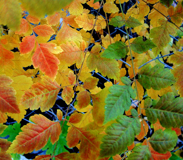
There doesn't seem to be enough depth of field, which isn't necessarily bad; but here I can't tell that the shallow depth of field is not unintentional because it doesn't seem to add anything to the picture. The pattern of the leaves and the fence is busy, but it isn't particularly creative. But I like the use of color, especially against the black background behind the chain link fence.
There seems to be a hint of some very nice textures and also colours but unfortunately these weren't presented to advantage. A little more adjustments in saturation or levels might have improved it. Another thing that doesn't help is the lack of a focal point. I'm not exactly sure where my eye is supposed to be drawn to. If all areas were equally sharp, this would not have been a problem but the blur on multiple spots makes it seem like there should be a focus somewhere which is not the case. Hope this helps.







 Add photograph to your favorites
 Add photographer to your favorites


 Photographer found comment helpful.


