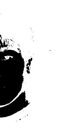
Not sure why this is 'blue side' - there's no blue - and it looks like it's been edited fairly substantially. The editing hasn't left enough detail for me to really get a sense of you; it could almost be an ink blot. It's stark, but also unreachable, for me.
Sorry - this image just doesn't work for me at all. Contrast is too high, so we're left with very little detail. It would make an interesting shot for a CD album cover, but as a self portrait I don't find this succeeds. Also the lone dot near the centre just seems odd
Unique! Great abstract. It's so nice to see a photo a little different from the rest. The black dot by itself is a tiny distraction. High marks for creativity! 8 =-)
I'm not going to give this a 1 or 2 because it is almost abstract enough to be interesting. I think some interesting things can be done with this technique...
Too much white negative space in this image. Maybe a different crop so the main subject is notso centered vertically. Try this with yourself in the lower left of the frame. I like when people go out on a limb to be creative and try something fun. Unfortunately, people don't reward that here... Good Luck.





 Add photograph to your favorites
 Add photographer to your favorites


