Camera:Gateway DC-T50 Location: Indian Rock, VA Date: Oct 23, 2005 Aperture: 1:2.8 ISO: 100 Shutter: 1/50 sec Galleries:Vintage, Travel Date Uploaded: Oct 26, 2005
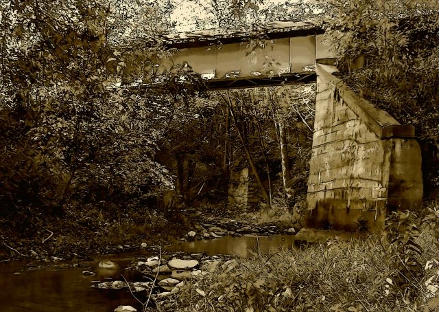
Taken on same day as Grain Challenge. This is RR bridge over one of the tributaries to the James River at Indian Rock, VA. I walked all over the place out in this wilderness and was trying to find a way to represent this environment appropriately and finally feel that I've done it some justice with this editing. I'm sure that some people won't like it, but I do.
PP included:
crop
straighten horizon
varying degrees of opacity layers of filters: poster cutout, sepia, backlit, & cutout
save for Web
Interesting shot... Overall, I like it. The foliage on the left makes the photo feel a bit "cluttered", or perhaps just serves to distract. I'm not quite sure which. I think that this shot could be even better if it had some more contrast, and maybe greater DOF. If you didn't use a wide angle to get this shot, I think shooting it using a wide angle with the same crop might help, too. Just some thoughts.
Beautiful! The processing is right as you said. I think the combination works as it helps to separate the different areas of the shot. The position and amount of bridge showing is perfect for the mood and setting as well. Very nice work!
I find this really busy and am not too sure about the sepia, maybe tone it down a bit, would also be intrested to see the color and a black and white version. The dark in the bottom left corner keeps drawing my eye, maybe crop a bit off the bottom and the left of the shot to get rid of that darker area?
Interesting old bridge / location. I think you have done a nice job capturing the old feel. The bridge support really stands out to me..more than the bridge itself. If I had one nit-pick, it seems that some of the leaves on the left have an odd flat coloring to them, like they were really bright or they were bumped with curves/brightness. Personally, I think I would have dropped the sepia layer opacity a bit, but that's just me.
In my opinion where you have so much going on in this image colour would work better to show the separation between the elements. Maybe at the same time bumping up the vegetation colours a little.
I think the color balance is great although there seems to be a bit of red in this image. The bridge itself is interesting and the smooth water makes for a great mirror.
I think the processing effect looks good! I guess it's a 'busy' sort of photo and a little hard to make out exactly what it is. Maybe if it wasn't so tightly cropped on the bridge perhaps? Maybe it is my monitor but it looks a little dark in the guts. Maybe slightly dodging would bring it out slightly. But, I do like this photo. Well done!
Interesting picture. It has a certain old/rundown look. There is a lot of texture to pull the eye away from the subject. Try cropping the bottom up to the area where the rocks are across the water. That would leave you some grass but no too much. Then try bringing it in from the left just a smidge. The bridge would be in more of the picture then. I really like it. Reminds me of family vacations when we drove across the states.
I'm not crazy about this one. Perhaps if I had been at the location, this would capture a feeling of being there for a memory - but for me as simply a viewer, it carries no real wow interest. I think the tone of it doesn't help as I think there may be some interesting colors to help add interest. Hope this helps!
Ok, First I love the processing, but for me the whole shot is too busy. I'm having trouble focusing in any main thing, which sadly I think maybe because of the processing which I love so much.
Very interesting. Very busy. This is a photo one should take more than a passing look at.
The processing is very good, great tonal range, very good choice for sepia.
I don't know yet if I'm one of the people who'll rave about the photo, I'll have to examine it for a while. I have a "lost, no direction" feel, I want to know what the best thing to see is and I feel left to fend for myself.
Technically A+. Composition I'm still wishy-washy. I'll have to ponder it some more.
At first, this image looks straight from the viewfinder. Then, I notice white in the leaves around the bridge and later in the grass. What has he done here? There is a subtle sense or the sureal. I think it adds that atmosphere you were looking for.




 Add photograph to your favorites
 Add photographer to your favorites


 Photographer found comment helpful.


