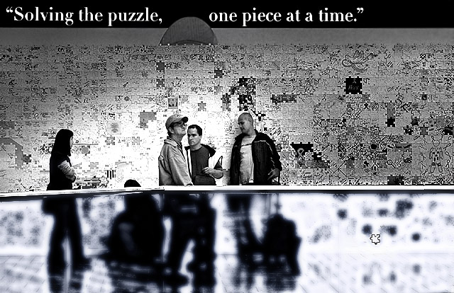
one of my favoirtes this challenge -- really like the split image, text adds to the effect -- would have liked a bit less on the left but understand why you cropped where you did
I think this is really cute and well done. At first I thought it was a transparent glass on an moving walkway. If it is, it still has boucoup processing. The interface between the blur and the rail could have been better with jaggies all over (could have been the resizing too). 6
Interesting photo. I like the black and white treatment, I think color would have been less effective. For me, if there had been only one person underneath the heading on the wall - it would have been even better.






 Add photograph to your favorites
 Add photographer to your favorites

 Photographer found comment helpful.


