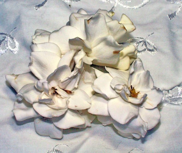
4 - Like the potential here. Criticism; in my opinion the gardenias are getting lost on the 'fabric background' - by the 'focal point' (seems that the embroidery in the fabric is sharper (may just be the coloring though)) than on the gardenias and, that the embroidery is too dominant for this shot. Either 'further back' or else more of a macro, to get the focus on (especially tips of) the gardenias, along with a more 'bland'/less 'busy' background (but obviously still white re the Challenge) would have made this a better shot in my opinion. Perhaps even a different 'composition' of the flowers, especially that top one, so the three were more 'uniform'. edit:typo
Message edited by author 2005-11-02 00:25:34. |







 Add photograph to your favorites
 Add photographer to your favorites


