criqtue club**
I love nudity haha!
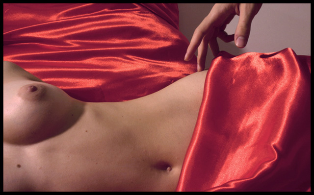
I like the idea, the lighting is a bit off though, the breasts have more lighting than the waist and gives it an unbalance lighting which also casts a shadow from her breasts. a suggestion I have...dare i say it is to crop off the breasts, i know i know i love that they are there but this shot will give it a mysterious and awesome look if it was only up to the waist. the background is also unbalanced a bit, there its half sheets and then a wall perhaps a flat background could have helped this shot as well.
the sheets look faded, and don't "bounce" out... the whole photo is rather bland, with some level editing in photoshop, the sheets would provide even more contrast with the subject..
This would be much better it you worked on your lighting a little. It is just to harsh and does not do "the nude" justice. A softer lights source with lots more shadow.
This is nice in composition but the lights/hot spots are distracting and the highlights on the red satin seem either oversaturated or too reflective from the lighting. Also, red doesn't evoke a "delicate" feel. It's more seductive. This whole photo has a "come hither" feel to it, which is far from delicate! It would have been better, IMHO, if you would have used lighterfabrics with a gossimier sheen or laces. Nice work.
This is a great composition, the lighting is just a little off. I wish I was better at lighting so I could tell you what I don't like about it. I think I'd rather see this with a higher contrast - so the background as black, the shadows darker, more highlight on the hand.
But I love the curves, the highlights in the satin, the arch of the hand. This is very nice work 7





 Add photograph to your favorites
 Add photographer to your favorites


 Photographer found comment helpful.


