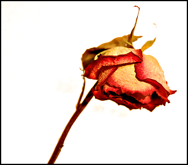
i think this is a wonderful shot... the low score is probably cus it didn't quite fit the challenge.... but outside of the challenge i think it's real nice!!
I find the beige smudges around the rose very distractin and think it may cause some negativity from viewers, however I found your photo style used on the actual rose very nice and the colorare well blended and eye appealing.
What an awesomely concieved interpertaion.... cough,cough.
Whoever you are, I am duly impressed. I'd give this the blue ribbon for the personification challenge too.
I like the idea of this. The detail of the rose is good but WAY too bright to really meet this challenge. A pale pink or pale yellow might have suited it better.







 Add photograph to your favorites
 Add photographer to your favorites

 Photographer found comment helpful.


