Author Thread
Post actions
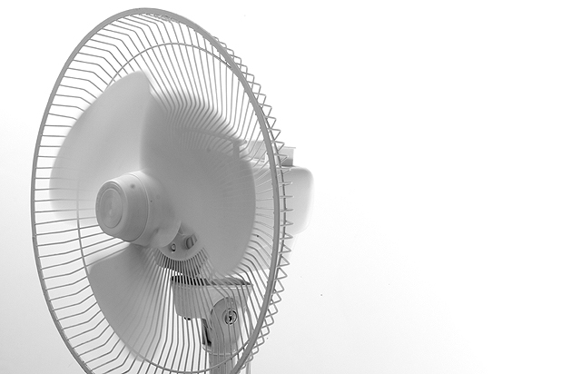
I gave this a 9...again, I loved the simplicity and it looks like there was little to no processing done and the photo just came out excellent!
Comments Made During the Challenge
Post actions
Great title, nice original take on the challenge good job
Post actions
i really like this image. it has a suttle sense of movement and it's a great shot of an otherwise ordinary object. i think i might like it a bit better had the bottom of the circle part of the fan not been cutt off, but i still enjoy this a lot.
Post actions
I think this would have worked better if the fan was to the right edge - the eye is drawn to the left and there is no where for it to go.
Post actions
Post actions
I think the negative space should be on the side that the fan faces...
Post actions
This is really cool. I love the slow shutter speed. My only complaint is that I would like to see the entire fan. I don't like the bottom being chopped off so much. I give this a 7:-)
Post actions
It is a shame that you cropped the bottom of the fan, i really think this is a strong subject matter for this challenge.
Post actions
HA HA HA THE title is funny. BUT it's white on white, not light on white. Hmmmmmm
Post actions
lol.cute title.good picture.







 Add photograph to your favorites
 Add photographer to your favorites

 Photographer found comment helpful.


