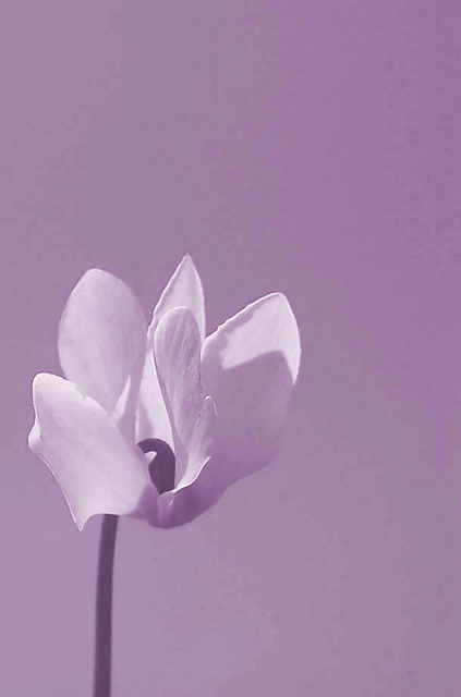
I really like the placement of the flower within the photo. And the petal texture sweetly complements the placement. The background though is 'pixelly'. Could it be due to excessive processing, an odd WB setting or the image size/dpi?
I really like the composition and delicate purple tones in this shot. The background is a bit distracting, but also it appears that the flower has been Neat Imaged a tad too much. Again, I'm not trying to shoot this down - I scored it a 7 in the challenge - it's a sweet photo! You've got a great eye for lighting & composition!
Your photo definately says delicate, I guess i really didn't notice the pixelizing in the background when I voted. This photo just seemed a little flat to me. I think it could of benefited from more contrast since its a monochromatic photo.
I did something I don't usually do and read the other comments first, I suppose I can avoid the obvious now. My first impression was it wasn't processed with enough color depth, hence the pixelized color gradient across the background. In the challenge I gave this a 5, I think I might have been flowered out by then. Tech & Art wise its a very pleasing image. I think it I would have liked it better if the hue were more to the cool blue/black range.
I'm not sure what you have going on with your background but it definately is hurting the flower. I can see what looks like little blocks of color kind of like what you would see with earlier colored computers. It definately is distracting from the flower.
Your flower itself is slightly soft. Could be in a little better focus.
I'm thinking your real issue here is you need more light, he shadows here seem very strong.
You have a nice simple composition here and it is working don't give up on flowers I'd say you almost nailed this one it just has some minor flaws to it.






 Add photograph to your favorites
 Add photographer to your favorites

 Photographer found comment helpful.


