I had a full critique done on your picture yesterday, but my internet service decided to hiccup right before I was about to send it, so I lost everything. I hope that I can re-create what I wrote.
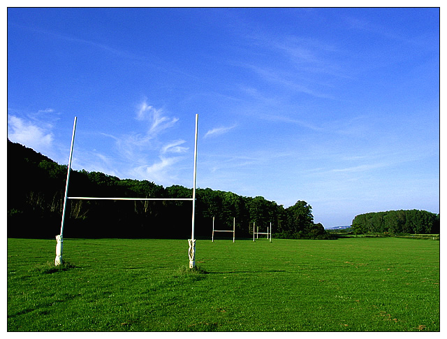
Challenge: With the goal posts off to the left of your picture, you have definately met the challenge.
Composition: This picture does have a simple subject. I like how the park disappears into the background into the trees and then you see the hills beyond. The sky is absolutely beautiful with the wispy clouds. The front goal post kind of bothers me a little. It looks like it is leaning inward. I don't know if this is caused by the angle at which the picture is taken or it was actually leaning inward. In any case, not a big deal. I wonder what it would look like if you were to take the picture closer to the first post. Just an idea.
Technical: I would say that this picture is technically sound and would not change a thing. Quality is crisp, clean and well focused. The lighting may be a little dark, but I'm using the computer at work and I don't think the monitors are well calibrated. If I remember right, you picture looked fine on my monitor at home. The brilliant colors are what makes this picture. I was looking back at some of your other pictures from earlier challenges and you always seem to be able to bring out excellent color. I am impressed.
Overall: A well done simple photo that I feel was scored appropriately. I was in the hospital during the voting phase of this challenge, so this is the first time that I'm seeing most of these photos. I would have voted this a 7. The simplicity of this photo lacks the "WOW" factor that would posess me to vote it any higher. I am, however, impressed with the quality of your work. So, keep up the good work and I'm looking forward to seeing what you come out with in furture challenges.
Nice feeling of openess - and lovely cloud shapes in the sky - nice light too. The perspective shift (or whatever it's called) on the nearest goal is a little weird, and there's a lot of jagged stepping down the vertical to the far left. Nothing quite exciting enough to really pull me in and keep me looking longer.
The colours are dazzling, with nice sharp focus and clear lines for each subject in the photo. Hmm, even looks slightly like my WinXP wallpaper "Bliss" LOL
You've taken an otherwise dull subject and made it interesting! I like the perspective here. The colors are really dramatic here, too. And I can't help but make the wise crack that this could be the new emblem of the 4H Club! - 8








 Add photograph to your favorites
 Add photographer to your favorites

 Photographer found comment helpful.


