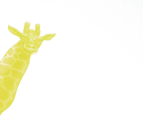
While I find your treatment interesting, for me, you've turned your photo into a graphic element. Compared with other entries it doesn't hold my interest too much and while the rule of thirds is good and so is negative space - again for me - there is too much white space.
I'm not sure if this is really light on white, as the yellow is very very vibrant rather than light. But.. it is lighter than the orange that giraffes normally are. I like the composition with the giraffe peeking from the side but the image is unappealing to me in general. Probably because of how bizarrely colored the giraffe is with no context to give it a reason why it is that color. I gave a 4.





 Add photograph to your favorites
 Add photographer to your favorites


