Hello from the critique club!
Great subject and fits the challenge very well.
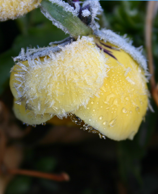
As you have questioned yourself, the focus seems a bit off, or atleast not sharp enough. Also looking at the picture, doesn't look like you sharpened it after resize, which you should always for presentation. Colors can take a little more saturation to make them pop out. Since its basic editing you can't do much about somewhat distracting branch at the bottom. A little more contrast will also enhance the subject.
Once again a good entry which can be improved will a little editing.
If you have any questions, feel free to contact me via pm
thanks,
Gaurawa |





 Add photograph to your favorites
 Add photographer to your favorites


 Photographer found comment helpful.
