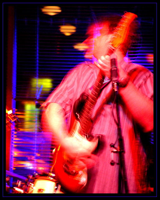
It woulda been better if he had been standing very still in a brightly lit space with good focus and an accurate range of tones. That's a terrible saturation and lighting for accurate skin tone. And look, his head is all blurry. Looks like he's playing an A. It woulda been better if he were playing a C or a D.
Wow! what the hell happened here. How did you end up near the bottom with this shot? People just don't get it. Although I knew it would not win, I had this in my top 10.
Oh well...Live and learn. Great shot John.
The placement of the subject in this photograph meets the challenge as the musician is off center. The total blur effect, which I believe to be purposely used, in this photograph confuses me when I look at this photograph. I would like to suggest next time you attempt to capture most of the image in focus while using the hands strumming the instrument to show the movement blur. This would have had a better impact for me. I must give you a 4 for this effort. RLS
This is a treat to view and interpret. You have captured not only the motions and sounds of this musician, but what one would imagine to be the energy of the moment and the surrounding environment. I'm impressed with the range of hues you were able to capture - this is not always easy in these settings. The saturation and contrast really provide the subject with an aura of sorts. The more I look at this shot, the more I understand that it is a harmonious union of vertical and horizontal lines. The window edge, mic stand, guitar strings, and shirt stripes all playing against the horizontal window blings, guitar frets. Wow - great job! Oh, by the way John, I like the PBase title better.
Crazy urban image. I like it. You've captured some wild movements but it hasn't totally ruined your photograph - in fact, just the opposite. Well done. Extra points for taking this and cranking it up a notch with some high contrast.
A riot of colours.. . Funky movements that bring to mind a jammin atmosphere. Electric blue and electric guitars - certainly 'off center' for the main DPC style and makes me feel more is happening to the viewer's left. Might have moved to keep the three lights/reflections at the top away from the subject.
I know what you're going for here (I have tried similar things myself), but this one isn't doing it for me. your reds are too strong (i know it was intentional) and your blues blend into everything. composition is very nice...movement works well for the subject as well. i might have cropped the noise on the left a bit...but then he wouldn't be off-centre...quite a conundrum. :)
I'd like to see it with a little less (only a little) on the reds, and a LITTLE less contrast. good effort in any event. I can appreciate taking chances.
A very courageous entry for DPC considering everything is blurred :-P Love the colors and the motion, perfect capture, and the frame sets it off nicely. I wouldn't change a thing!






 Add photograph to your favorites
 Add photographer to your favorites


