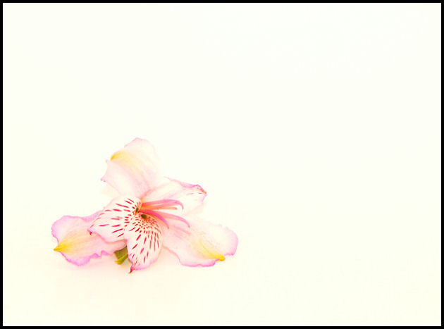
I'm going to start out by saying WHY WHY WHY that black border the image stood well on its own but that border seems to say hey look out here on the edges where there is nothing...definately it was a big distraction.
Next there does seem to be a bit of noise in the background.
Also you seem slightly overexposed on part of the flower. just a tad to much lighting.
Now that I'm done complaining what I do like about the photo is the simplicity of it the colors and the way the flower stands out. It is does meet the challenge well as being delicate.
I generally like simple compositions such as yours, but for me there is just a bit too much white space here. Also, I find the choice of black for the border a bit overwhelming and takes away from the photo's softness for me. I wonder how the border would look if you chose the purple color from the flower?
Pretty. The first thing that hurts you is the dark frame. I'd have used one of the colors of the flower - perhaps the palest - yellow or lilac maybe. Love the use of negative space.





 Add photograph to your favorites
 Add photographer to your favorites

 Photographer found comment helpful.


