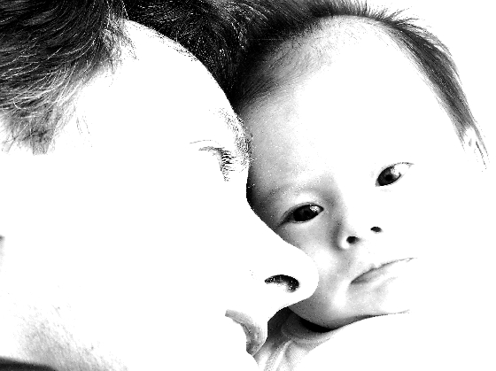
Composition: You have a very nicely composed shot here, it has a lot going for it. I like the tightness of it as it gives the viewer the feeling of bonding between you and your little girl. The only thing bad to me is you are a little too much up the nose, which takes some of the appeal away.
Technical: I hate to say it but I feel that you went quite a lot too far in the "High Key" aspect of this wonderfully composed picture. I want to see more detail and less white area. It appears that less sharpening would have been good too.
Challenge: The focal point seems to be more on Sara than you, and I don't blame you a bit! Some viewers have voted you down for this but I think you have made up for it with the emotion and feelings that are displayed in your work.
Suggestions: I would really like to see a less high key rendition. Of course you have probably looked at the picture in many variations already, and have chose this one as your favorite, and that is all that really counts.
Keep up the great work!
Disclaimer:
Bear in mind that I am here to learn, just as many others and any comments that I have made are not intended to be offensive in any way, and are only constructive criticisms. If you wish to comment or discuss this critique please feel free to do so at any time.
Thank you,
Dick Pattee (Autool)
Autool@attbi.com
A little too high key for my tastes. Most of the features and bones of the face should be distinguishable in the dad. This bright makes them invisible.
i like the high-key approach, but think you may have overdone it (I'm guilty of this all the time). I lose parts of that sweet little pumpkin's face inthe flare. beautiful composition; drop the contrast as soon as the competition is done and get a frame on it.
the high key really works here. this is a beautiful portrait.. but it is not really a self portrait. I see what you are trying to do, but it ends up being a portrait of the baby, as the attention is brought there by your eye direction, and by the baby's eye direction to the camera. This photo is a treasure. don't get me wrong.
I like the dreaminess of the high contrast, and the title says it all. My gripe here is that it is to me much more a shot of "Version 2" than the original, and therefore less a self-portrait than it would be if the camera was facing you instead.
This picture has a wonderful essence. The white-out efect is perfect. If it wasn't for the over-sharpening, it would be one of my favourites. The over sharpening distorts important parts of the image, like the eyelashes and eyebrows. I give you a 6.
I love the poses and the high key image, although I think it may be just a tad too bright, especially on your cheek. The way your hair merges with that of the baby's gives a unifying effect which is also very pleasing. Adorable shot.
The photo is too bright, but the baby is adorable and the way you are looking at it is great. It's got the aww factor going for it. 7 just because its too bright..sorry.






 Add photograph to your favorites
 Add photographer to your favorites

 Photographer found comment helpful.


