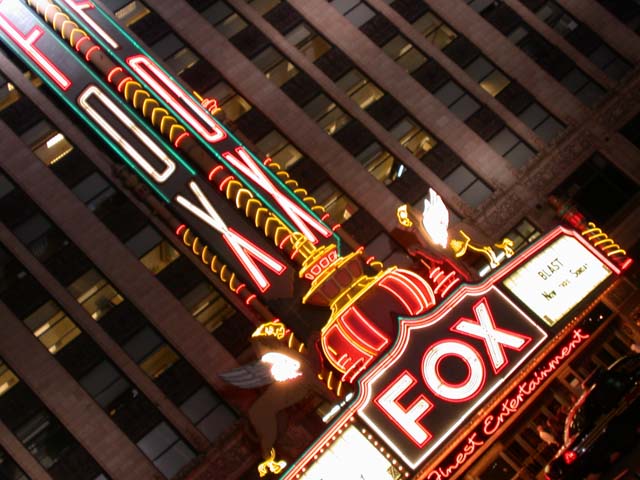
cool idea - I like the diagonal. A little less exposed and you might get better colors and be able to see the words on the marquee - the building would be darker but that would add to the drama of your composition. Nice off-center.
Nice work! I wonder how many people will something like "I think it might be tilted a little bit." Anyway... I think you did a great job with the exposure here.





 Add photograph to your favorites
 Add photographer to your favorites


 Photographer found comment helpful.


