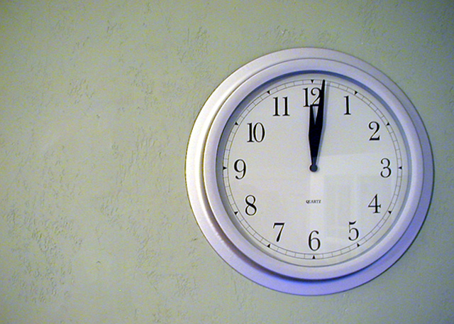
The clock is off-center, and the picture is clear, but IMO it's not really a picture that will catch people's attention. The door (or window) reflected on the clock is distracting. Also IMO, the picture might be a bit better if the three small sides (bottom, right, and top) were the same size. ~4
I don't really feel the off-centeredness of this subject adding anything to the photo. Might help to get closer to the wall and shoot across the clock instead of straight at it. As it is, this image doesn't really say a lot, in my opinion. Maybe because everything about it is formal except the extra white space on the left?
Nice & sharp & simple... although perhaps not the most exciting of subjects. There seems to be a little excessive grain (just a teeny bit), and the reflection in the clock is a little distracting.







 Add photograph to your favorites
 Add photographer to your favorites


