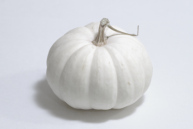
I question your lighting, you have shadows going in several directions and that just becomes distracting. Your lighting also seems to be an issue with the background you have a grayish tone going on with the white.
This is very simplicitic and I question your placement in the center of the photo it tends to leave it boring.
Now as for what I like about this I like the simple unclutter photo. Your concept is good and you definately have met the challenge.
Man! I came back to see how this shot did....It was my only 10 in the challenge. There were several other shots I liked but this was my favorite. Even being in the center....I loved the simplicity of it and the unusual white pumpkin. (just read about those on cnn last week)
The 2nd one I've seen. I like the light and shadow. All this one needs is more negative space to one side, or the top or bottom, so it isn't so centered.
While this shot meets the challenge, the composition leaves something to be desired. Placing it somewhere other than dead center would probably create more interest.
8 - Very good. Whilst no expert on 'highlight control' re the Challenge, seems to me you have done very well to not 'blow' any surface, and still retained the 'outline'. Criticism; although having just said that, I would still like to be able to decipher more texture on the skin. The shadow is good, compositionally I like it (although wonder about more space 'somewhere' or even a tighter (more square) crop). The only other thing I could say would be, technically, had the background/lighting been more 'even' this would have been even more 'challenging' to photograph, and/but possibly made this 'pop' more and have more impact, in my opinion.





 Add photograph to your favorites
 Add photographer to your favorites

 Photographer found comment helpful.


