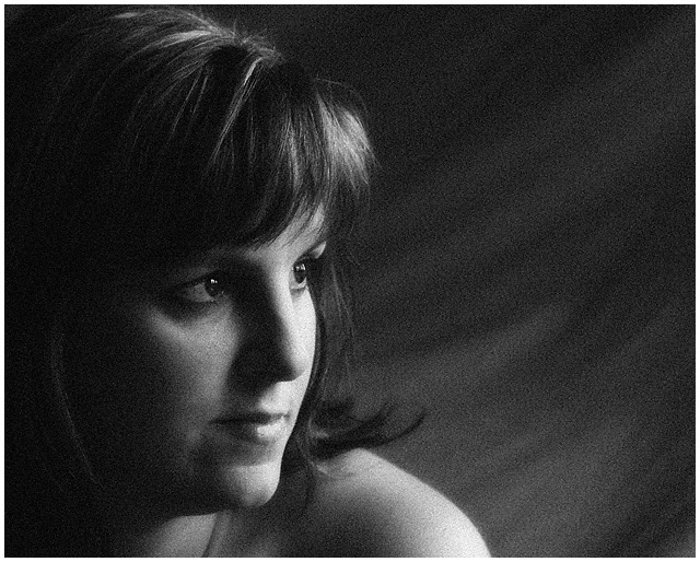
This is Sheryl, my beautiful wife! These days, she's a little stressed as she is working on completing her Masters of Education degree while working full-time, being a mom and putting up with me.
Shot using natural light only.
Photoshop Processing:
- RAW conversion
- Crop to 4:5 ratio
- Curves Adj. Layer
- Flatten
- Duplicate Layer created
- Apply Gausian Blur to Background Layer
- Make Mask to Background
- Select RGB Channel
- Hue/Saturation Adj. Layer
- Curves Adj. Layer
- Selective brush out of unwanted editing
- Flatten
- Hue/Saturation Adj. Layer
- Channel Mixer Adj. Layer (Monochromatic)
- Curves Adj Layer
- Flatten
- Add Monochromatic Guassian Blur @ 12.5
- Resized
- USM
I hope you like it!! I'm really pleased, and so is Sheryl, with the way this turned out.
Statistics
Place: 52 out of 274 Avg (all users): 5.7653 Avg (commenters): 7.3333 Avg (participants): 5.6116 Avg (non-participants): 6.0133 Views since voting: 1038 Views during voting: 319 Votes: 196 Comments: 9 Favorites: 0
Beautiful. I personally love image grain and this is an excellent example. Love the lighting and tonal range. Had I voted, I would have given you at least a 9.
Well Richard...I can quite honestly say that I find not a thing amiss with this image...no very helpful...I know. The soft moody light is very effective and quite flattering. The grain is also very pleasing and looks quite a bit like "real" film grain. The lighting, the grain, and Sheryl's expression all come together very nicely to make one lovely emotive cocktail.
Upon further study, I almost detect a bit of a smirk? Am I deceived? This brings a smile to my own face in relating this smirk to the whole "mask" idea...your wife is a tolerant woman indeed, but then again she is working on a masters in education so I should think tolerance is quite a large part of the whole teaching gig...hmmmm...she is definitely due for a bit of pampering, don't you think? : }
I think your choice of B & W was perfect, then again I favor B & W, sometimes color can be distracting...it all depends on the image really, and taste....we all have different tastes. One thing I might suggest, and I use them all the time, are Duotones/Quadtones. This article found at Luminous-Landscape, is quite imformative.
Here are couple of examples of how a quadtone could change this image:
The top example uses a quadtone you can get here, the sepia example is a quadtone I came up with. Quadtones are fun to experiment with, I hope you don't mind my borrowing your image so I could show you just how a quadtone can subtly change an image. I use the top example quite often, it reminds me of how an actual B & W print looks after being Selenium toned, something I did often back in my darkroom days. Anyway, I think I've rambled on long enough, but if there is anything else you'd like to talk about, please do not hesitate to contact me...now go give Sheryl a foot rub! She definitely deserves one. : }







 Add photograph to your favorites
 Add photographer to your favorites


 Photographer found comment helpful.


