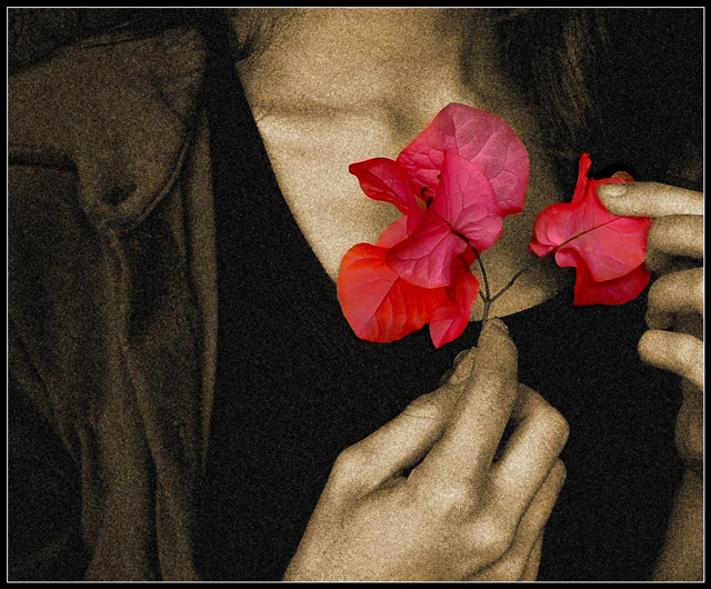
Not really what I wanted to enter, but I miss the update button ;-) YES I know this is maybe a tad overedited. I was originally goint to make it ALL sepia/grainy, but the flower blended in too much, and could't be clearly seen.
-editing: contrast, selective desat, selective grain, burn, sharpen, yada, yada, blah.
Statistics
Place: 6 out of 274 Avg (all users): 6.6000 Avg (commenters): 8.1176 Avg (participants): 6.4274 Avg (non-participants): 6.8642 Views since voting: 3892 Views during voting: 343 Votes: 205 Comments: 33 Favorites: 14 (view)
The challenge was Image Grain and your image certainly meets the challenge brief, as the comments and your score demonstrates.
Technical:
Execution is spot on. Despite the introduction of grain into your photo, you have managed to retain the finer details. The use of selective desaturation gives more impact. I noted that you put editing details in comments, a useful and helpful addition for other people who look at the shot, although I still haven't found yada, yada, blah in PS...I've been looking for ages:)
Composition:
It is an infuriating composition, hands are cut off at the knuckles on one hand, wrist on the other and there is no head...but it works well! The positioning of the flower to the right of picture also fits perfectly.
Personal:
As I have just stated, this infuriates and also intrigues. The eye is drawn round and round the shot, always fixing on the flower. The sepia works beautifully with the flower - which appears not to show grain? -and the colour of the flower is great. Your overall score was good, but I would have expected it to finish in top 3. Congratulations and keep at it. Hope this has helped and was constructive for you.
Nice use of selective desat and grain. Nice composition. Only nit picky thing is the odd coloration on the edges of her fingers. I'm not sure what it is, but it makes her skin look blothcy which distracts from the picture (IMHO)
Cheers
Excellent use of color grain. This is a hard thing to do. Your color enhances the shot, and the grain makes you think of age, with is an excellent contrast to the softer feel of the leaves. 8
I like the image, however I don't feel it meets the challenge. Here is why - if there really was image grain in the image it would be all over the image and not selective as you have processed the image. There is absolutely no grain on the leaves yet all around it and that that is touching it has grain. In my opinion it would have been stronger if it was not selective. It still would have impact.
*well ok the challenged ended before i got back to viewing and bumping but i couldn't go any higher on this 1 any how......
i really think u should've placed 1st in this challenge there wern't many others that worked with grain the way film really works with it...so i was left th throw away my film routs and look for the best done digital rendition...and really truly this makes the most of the medium...
however i still think the title is a negitive but what can you do...can't have it all 100% and it is just my poor opinion anyhow.....closing statments still stand*
-best of luck
btw i think the title detracts but i didn't read it till after so u have taken a great stand alone shot....and i hope it gets the vote it needs to place as well as it should





 Add photograph to your favorites
 Add photographer to your favorites

 Photographer found comment helpful.


