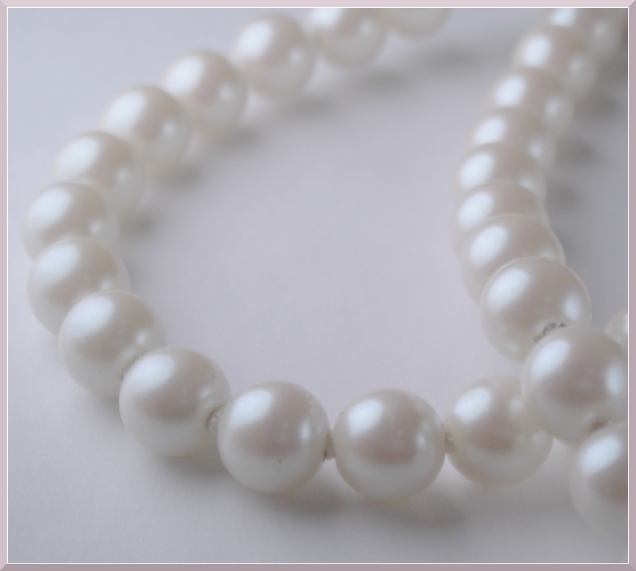
Took about 74 shots. This was the one I liked best. I wanted to tone down the beige-ish color but retain the slight pink which using a mild desaturation seemed to help do.
Curves
Bright/Contrast - +10/-20
Gaussian Blur - 5.0 Vert/Horiz
Partial Desaturation - -30
Crop
Scale Image - 620 on long side
Add Border - white
Add Border - greyish
10-25 #14
Statistics
Place: 88 out of 277 Avg (all users): 5.3014 Avg (commenters): 6.0000 Avg (participants): 4.9817 Avg (non-participants): 5.5029 Views since voting: 1066 Views during voting: 364 Votes: 282 Comments: 14 Favorites: 0
This photograph would have been more intriguing if the depth of field had been more shallow, with the front pearls more in focus and the rear pearls more out of focus. As it is, there are no substantially sharp areas to highlight the contrast between the "light" and the "white".
nice pearls but the picture seems out of focus (or maybe its my comp screen) the focus seems to be on the pearls crossing over on the right...a little distracting
6 - Like the potential of this and the concept. Criticism; for what appears to be a macro (apologies if wrong) seems 'too close', or maybe it is just over blurred/softened. Definition/sharpness in at least a few 'pearls' at the fore would have made this much better in my opinion. I like the angle, and whilst I also like the 'composition'/centering, I wonder if some more 'space' left or fore, may have also made this better, not sure. As far as 'highlights' go, while no expert, seems you have done a good job to not blow any in this.
Wow, very nice. Its simple, yet classic. Love the pearls and the way you filled up the picture with them. Great frame ties it together with the background.






 Add photograph to your favorites
 Add photographer to your favorites


 Photographer found comment helpful.


