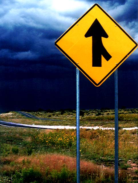
I didn't have much time to work with that thunderstorm coming through! The light outside was really strange and eerie and seemed to oddly illuminate the sign.
Statistics
Place: 52 out of 138 Avg (all users): 6.0000 Avg (commenters): 7.0000 Avg (participants): 6.1279 Avg (non-participants): 5.7381 Views since voting: 1701 Votes: 128 Comments: 15 Favorites: 2 (view)
I thought I had seen my favorite of the challenge and then this! The bold yellow of the sign against the dark blue clouds. Not only is the sign off center - it directs the viewer off the road that is leading to the dark horizon - diverting the eye to the bright sky above. The photo makes us off center by looking at it. I love the golden light, the dramatic contrasts. Everything works here! 10
Wow, interesting! Great choice for off-center. The colours look almost a little overworked, but actually I like them. The yellow on the sign is great. I wish you'd included just a little bit more space on the left side of the sign. ~8
I dont understand how you got the sky so dark near the horizon. The image looks edited/unnatural. Other than that the colors are pretty powerful, although I think saturated a tad too much.






 Add photograph to your favorites
 Add photographer to your favorites


 Photographer found comment helpful.


